NubankWage Portability

finance
A new improved experience in the way of receiving salary in Brazil
My Role
UX Research
UX Design
UI Design
Team
1 Project Manager
1 Product Designer
5 Engineers
Year
2019

Overview

In 2018, Nubank launched wage portability in its app. However, in 2019, we identified some opportunities for improvement:
Only 57% of customers who requested portability were approved and 37% of customers who had the request denied tried to reapply.
This rate is similar to the industry average, but we thought we could reconnect with users.
Research

We selected 10 customers from our database whose portability request was denied. And we found that:
  • The user did not find the bank in the list and entered another option;
  • The user wasn't sure which bank they received their wage, because they had already made the portability request previously
  • Some accounts weren't a wage-specific account
  • The user wasn't sure which was the correct CNPJ (similar to an Employer ID) of the company where they worked

Usability Test

Session 1

Introducing the portability flow for 5 users. These were the main insights:
  • Users would look for the CNPJ in the employment contract, employment card, company website, HR and Google search;
  • They would add the information to ask HR for help, because not everyone knows what ‘Razão Social’ means;
  • Users would get confused because different technical terms were used to describe their employer’s information;
  • Users found it unclear when and how they would receive a confirmation after wage portability request (whether via email, in-app, etc);
  • They were not familiar with similar technical terms used to describe different things ('Razão Social' and 'Nome Social');

Session 2

We made some changes and talked to 4 more users. These were the main insights:
  • Users would look for the functionality on the app's main screen, in the bottom menu area;
  • The 'Deposit' function didn't convey the idea of ​​portability, because the user didn't need to deposit anything. The 'Transfer' function would make more sense as you "could transfer your salary here";
  • The new main screen text was better accepted and all users took about a minute to read everything;
  • The action of having to look for the CNPJ somewhere and then go back to the flow, impacted the drop in conversion;
  • There was doubt if users needed to contact the bank of origin to finalize the process;
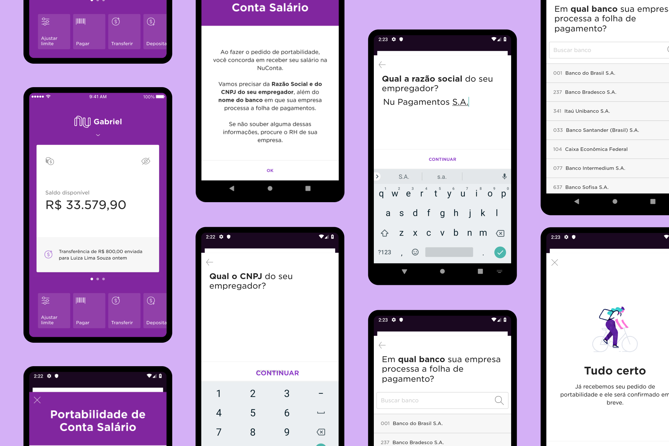
Original Screens

Solution

We presented a new proposal to increase the conversion according to the research and tests done previously.
These are the changes we decided to implement:

Content

  • Changed the copy from "Receive salary" to "Bring my salary";
  • Changed the copy from "CNPJ of your employer" to "CNPJ of the company where you work";
  • Changed the copy from "In which bank does your company process payroll?" to "In which bank do you receive your salary?";

Experience

  • Added a new entry point within NuConta (bank account);
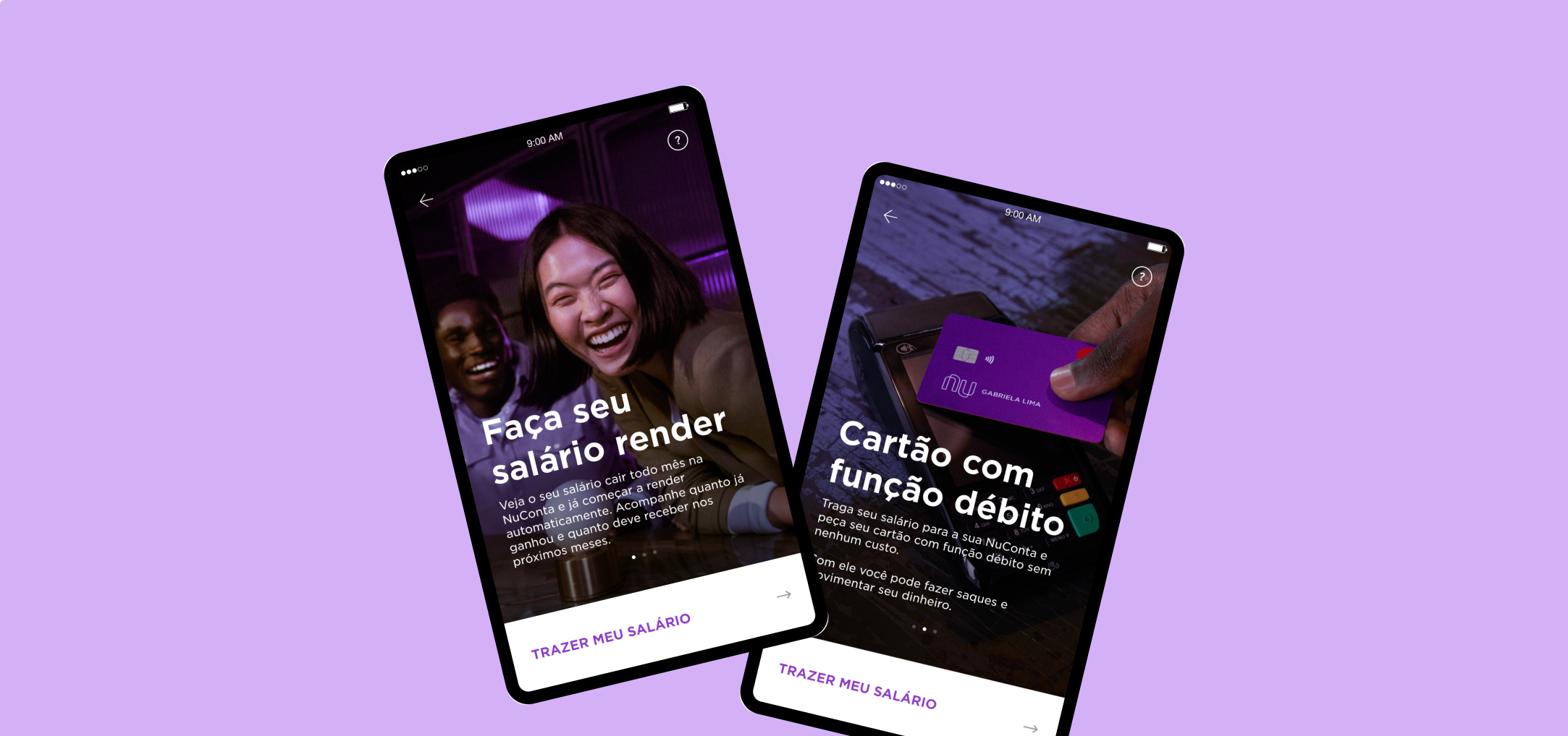
  • Inserted a marketing screen emphasizing portability benefits (automatic income, debit card and 24/7 customer service);
  • Included a password screen, because, even though it adds friction, it is also more secure and provides a sense of completion;
Improved Screens

Takeaways

Wage portability was my first Nubank project. Today, more than 4 years later, I would have done some things differently. These were my lessons:
  • It is extremely important to talk to users. Calling customers would have been faster than face-to-face chatting, so if I had a little more time, I would have dedicated it to writing a script and interviewing more users.
  • People like to feel that they are part of the discovery and improvement process. This was the first place I didn't have to sell the importance of research, and even the company's employees were happy to help :)
  • Just small changes in copy can make a big difference in the experience!